 Draw Anything
Setting up the perfect digital canvas
Four decisions — background, size, orientation and device — shape how a drawing feels before you make a single mark. Most people never make them consciously, and it shows.
A canvas drawing app usually opens on a white rectangle and most people start drawing immediately. That is a missed opportunity — the background is the single largest area of colour in your finished piece, and it interacts with every stroke you place on it.
Choosing a background colour
The rule is simple: choose the background based on whether your subject is defined by darkness or by light.
White — line-led drawing
Use white when the drawing is carried by its outlines: sketches, ink-style illustration, cartoons, technical drawings, anything you would traditionally do in pen. Dark lines on white have maximum contrast, and white keeps colours reading as their true hue.
White is also the right choice when you intend to print or share the piece, because it matches paper and sits cleanly on almost any social feed.
Black — light-led drawing
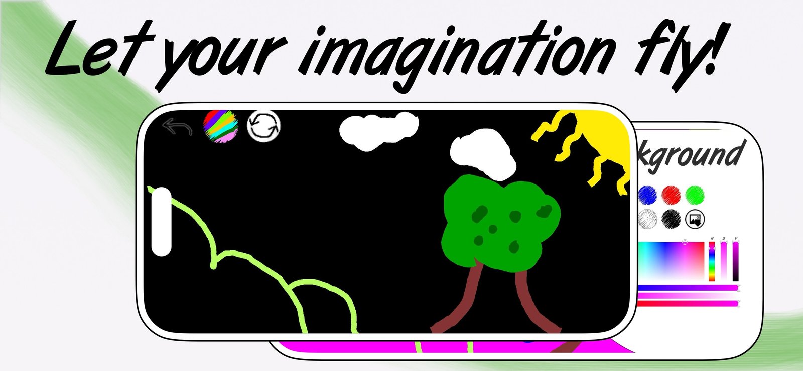
Use black when the subject emits light: neon signs, night scenes, fire, stars, glowing effects, underwater scenes. Saturated colours look luminous against black in a way they never do against white.
There is a practical benefit too. On black, a bright lime or magenta stroke needs no outline to separate it from the background — the contrast does that work — so drawings come together faster.
Coloured paper — mood in one tap
A mid-tone background is the professional's shortcut. Because it sits between your lightest and darkest values, both highlights and shadows show up against it, and the drawing feels unified immediately — nothing looks like it is floating on emptiness.
- Warm peach or cream: friendly, nostalgic, good for character work and children's illustration.
- Soft blue: calm and cool. Excellent for skies, water, and anything meant to feel spacious.
- Yellow: loud and energetic. Strong for bold graphic work and pop-art styling.
- Deep colour (dark blue, dark green): behaves like black but with more character.
Set the background first — but not irreversibly
In a well-built canvas app the background is a separate layer from your strokes, so you can swap it at any point without damaging the artwork. Draw on white if you like, then cycle through backgrounds at the end. It is a free experiment and it frequently transforms a flat drawing.
Backgrounds and palettes that work together
Some combinations reliably work. These four are worth keeping in mind:
- Black canvas + lime, magenta, cyan. Maximum vibrancy. This is the neon look, and it is nearly impossible to make ugly.
- White canvas + black outline + two flat colours. Restricting yourself to two fills forces good composition and always looks intentional.
- Peach canvas + brown, cream, deep red. Warm and cohesive, ideal for portraits and character illustration.
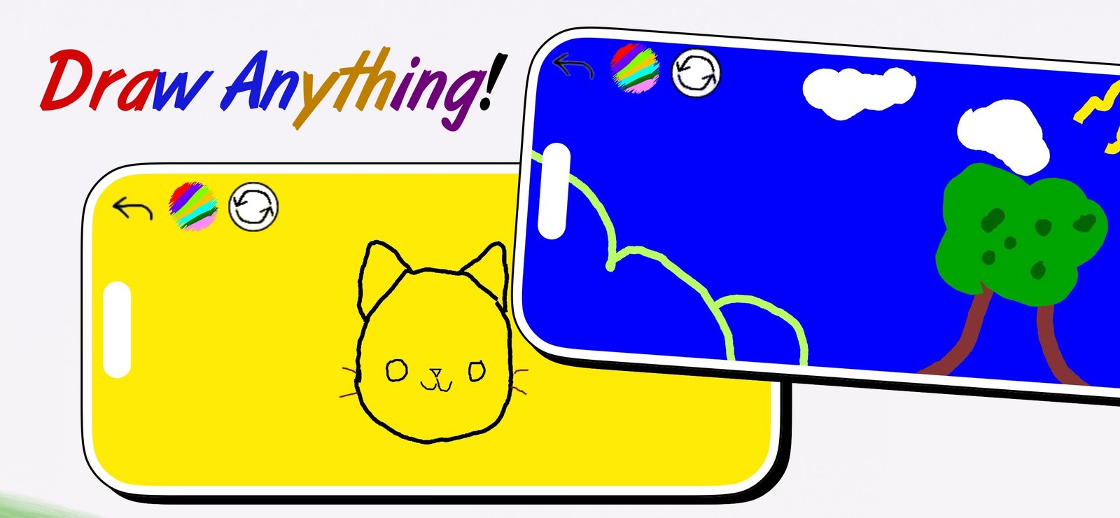
- Blue canvas + white + yellow. Instant sky. Clouds in white, sun in yellow, and the background is already doing most of the work.
The common thread is limiting the palette. A drawing with four colours almost always looks more considered than one with fourteen.
Orientation and composition
Hold the device the way the subject wants to be seen. This sounds obvious and is routinely ignored.
- Landscape for scenes, horizons, anything wider than it is tall. It also gives your hand more lateral room, which makes long confident strokes easier.
- Portrait for figures, faces, trees, buildings — anything vertical.
Then leave breathing room. The most common composition mistake is drawing the subject too large and clipping it at the edges. Aim for the subject occupying roughly two-thirds of the canvas, and place its centre slightly off-middle rather than dead centre.
iPhone or iPad?
Both run the same app and open the same drawing, but they suit different work.
iPad is better for anything detailed. The larger surface lets you draw from the elbow and shoulder rather than the fingertip, and full-arm movement is what produces smooth, confident curves. It also supports Apple Pencil, which adds genuine pressure sensitivity.
iPhone wins on availability. The best drawing device is the one in your pocket when you get an idea. For capturing a composition quickly, sketching on a train, or a five-minute practice session, the phone is the correct tool — and a phone sketch can always be finished on the iPad later.
Why a distraction-free canvas matters
Notice in the screenshot above how little interface is visible — an undo arrow, a tool button, a reset button. Everything else is canvas.
This is not only aesthetic. On a phone or tablet, every pixel of toolbar is a pixel you cannot draw on, and every visible control is a small invitation to fiddle instead of draw. A canvas app that collapses its controls is making a deliberate trade: fewer options on screen, more room to work and less friction between an idea and a mark.
A 30-second setup checklist
- Is my subject light-led or dark-led? Light-led goes on black. Dark-led goes on white. Unsure means mid-tone.
- Which way does the subject want to be held? Wide scene, landscape. Tall subject, portrait.
- How many colours am I allowing myself? Pick three or four now. You can always break the rule, but decide it deliberately.
- What is my silhouette brush size? Set it large before the first stroke so the outer shape has weight from the start.
- Is the subject going to fit? Plan for roughly two-thirds of the canvas, slightly off-centre.
Five questions, half a minute, and the drawing starts from a decision instead of a default.