 Draw Anything
How to paint digitally on your phone
Painting is not drawing with colour added. It is a different process that works from large shapes down to small ones — and that process translates to a touchscreen better than most people expect.
Painting vs drawing: the actual difference
Drawing builds a picture out of lines. Painting builds it out of areas.
That distinction changes the order you work in. A drawing goes outline first, fill second. A painting goes the other way — you put down the big blocks of colour first, with no outlines at all, and only later decide whether any lines are needed. Many finished paintings contain no outlines whatsoever.
This matters on a phone because blocking colour is something a fingertip is genuinely good at, while fine linework is the thing a fingertip struggles with. Painting plays to the device's strengths.
The habit to break
If you find yourself carefully outlining a shape before filling it, you are drawing, not painting. Put the outline down and place the colour block first — you can always add a line afterwards, and you will often find you do not want one.
The five-stage painting process
- Set the background Pick your paper colour before anything else. A mid-tone background means every subsequent colour has something to react against, and no area of the piece is ever left looking empty. See the canvas setup guide for which background suits which subject.
- Block in flat shapes — no detail Take the marker at a large size and lay down the main areas: sky, ground, the mass of a tree, the body of an animal. Squint at the canvas. If you can tell what the painting is going to be from blurred colour blocks alone, the composition works. If not, fix it now while there is nothing to lose.
- Layer texture over the flats Pass the crayon over your flat areas in a different tone of the same colour. Because the crayon deposits broken, semi-transparent flecks, the flat block underneath shows through and the area gains a surface. This one move separates a painting from a colouring-book fill.
- Build depth with overlaps and erasing Overlap a second marker stroke where you want shadow — separate strokes accumulate, so this gives you a darker tone for free. Then take a small eraser and cut highlights back out of the filled areas. You now have three values from a single colour.
- Add the few details that identify the subject Switch to the pencil or a small brush. Add only what the viewer needs to read the subject: the branch structure of a tree, the eyes of an animal, the line where water meets land. Stop earlier than feels comfortable — overworking is the most common way a good painting is lost.
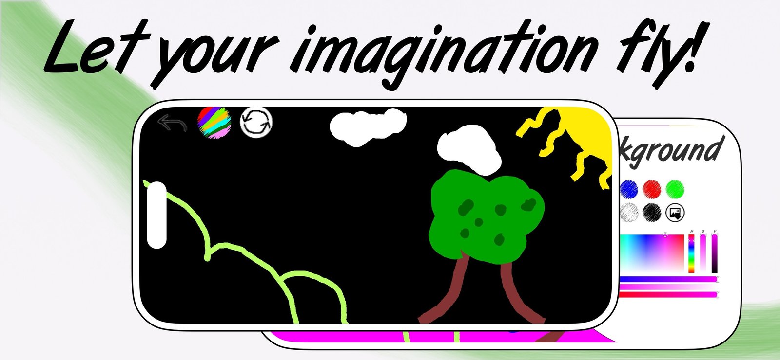
The landscape above is exactly this process. Black background, flat blocks for hill and tree mass, then a small number of details — the trunk lines, the dots on the foliage, the cloud shapes. No outlines anywhere.
Getting depth out of a flat palette
A fixed palette of a dozen colours sounds limiting. It is not, because depth comes from value — how light or dark something is — far more than from hue. Four techniques to extract more values from a small palette:
Overlap for darker
Two translucent marker strokes over the same area produce a deeper tone than one. Three produce deeper still. You now have a three-value ramp from one swatch.
Erase for lighter
Cutting into a filled area with the eraser lets the background colour through. On a white canvas that reads as a highlight; on a coloured canvas it reads as the paper tone showing through, which is a classic watercolour effect.
Let the background do the work
Leave patches of background unpainted on purpose. Deliberate gaps read as light and air. A painting where every pixel has been covered usually looks heavy.
Use a neighbouring hue instead of black for shadow
Shadows on a green hill should lean blue or deep green, not black. Black shadows deaden a painting. Reaching one swatch along the palette instead of straight to black is the single most effective colour upgrade a beginner can make.
Painting well with a finger
Most people painting on a phone are using a fingertip, and there are techniques that specifically suit it:
- Work larger than feels natural. A fingertip covers a lot of screen. Set the brush size up and paint in big gestures rather than fighting for precision you will not get.
- Zoom out mentally, not in. Judge the painting at arm's length. Detail invisible at that distance is detail not worth adding on a phone.
- Use the edge of your fingertip for finer marks. Rolling onto the side of your finger gives noticeably better control than the flat pad.
- Let the eraser be your precision tool. Filling roughly and then trimming the edges back with a small eraser is far easier than painting an accurate edge in the first place.
- Rotate the device, not your wrist. Turning the phone so an awkward stroke becomes a comfortable one costs nothing.
If you paint often and want more control, an iPad with Apple Pencil adds genuine pressure sensitivity — but plenty of good work gets made with a thumb on a bus.
Choosing colours that hold together
The fastest route to a painting that looks intentional is to limit the palette before starting. Three reliable schemes:
- Analogous: three colours that sit next to each other — blue, cyan, green. Always harmonious, naturally calm.
- Complementary: two opposites plus a neutral — orange and blue with cream. High energy, strong focal points.
- Monochrome plus one: every value of a single colour, plus one accent used sparingly. The accent becomes the subject automatically, because it is the only thing of its kind on the canvas.
With PRO's Infinite Colour you can dial exact hues with an HSV field, RGB sliders or a hex code, which makes building a specific scheme straightforward — and lets you reproduce the same palette across a series of pieces.
Finishing and exporting
Two questions tell you a painting is done: can I read the subject at a glance? and is there a clear lightest and darkest point? If both are yes, stop. Additional detail past that point usually subtracts.
Then export at full resolution. In the app, the share icon sends a high-resolution image straight to Messages, social media or your photo library. In the browser canvas, Save PNG downloads the image at your screen's full pixel density with the background colour baked in.
Keep the files. A folder of finished pieces from the last three months is the most motivating thing you can own as a beginner, and it makes progress visible in a way that memory does not.